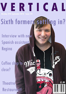
Overall I enjoyed making the magazine and I think I will do it as my final idea. I am strongly interested in advertising as it's a career I want to go into when I am older and making the magazine was remotely similar to making an advert so I enjoyed it a lot. The colours used go together well and compliment the image nicely. I chose these colours because the image was of a male so I thought I'd use a slightly femenine colour to balance out the magazine, making it appealing to both male and female. I'd say the age range would be around 14 to 17 year olds because the articles in the magazine are relevant to them.
The part I found hard was using Photoshop as a whole because I'm not very experienced using it, but I think the more I use it the more confident I'll become and the better my skills will be. The part I found quite easy was inserting the fonts and placing them were appropriate.
I'm quite pleased with my magazine cover although when I do my final one I will think about the consumer of the magazine and use colours, fonts and images suitable for the reader.
 |
| Magazine front cover |
 |
| Contents page |


Meg. Try and include some thoughts about your audience in this post. You've selected lavender as a dominant colour in your magazine. Why did you choose that colour and who would it appeal to? Similarly the name of your magazine and the focus of your articles will also appeal to a certain type of students, who are they and how and why did you target them?
ReplyDelete