Wednesday, 29 September 2010

Post production

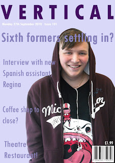
   Overall I enjoyed making the magazine and I think I will do it as my final idea. I am strongly interested in advertising as it's a career I want to go into when I am older and making the magazine was remotely similar to making an advert so I enjoyed it a lot. The colours used go together well and compliment the image nicely. I chose these colours because the image was of a male so I thought I'd use a slightly femenine colour to balance out the magazine, making it appealing to both male and female. I'd say the age range would be around 14 to 17 year olds because the articles in the magazine are relevant to them.
   The part I found hard was using Photoshop as a whole because I'm not very experienced using it, but I think the more I use it the more confident I'll become and the better my skills will be. The part I found quite easy was inserting the fonts and placing them were appropriate.
   I'm quite pleased with my magazine cover although when I do my final one I will think about the consumer of the magazine and use colours, fonts and images suitable for the reader.
Magazine front cover


Contents page


Production

   To create the magazine firstly we had to go and take some pictures of what image we wanted on the front cover, followed by the images we wanted on the contents page. Then we uploaded the images taken onto the computer so we could use them on Photoshop. After uploading the chosen image, I used the 'Magnetic lasso tool' to cut around the image and could take the background off the image, and then set it as a new layer. After using this tool I gradually become familiar with it and found it very usful when cutting my images. I then had two layers- one of the image and the other as the background. After adjusting the image to the correct placement and size, I set the background as a light purple and the started to add the text. I went through a variety of fonts for my title, headings and subheadings- the one I chose in the end was 'Tw Cen MT Condensed'. I had the name of the magazine in a dark purple, the headlines and subheadings as a lighter purple and then the price, issue number, and date in white.
   Next, I created the 'Contents' page. It had the same layout as the front cover with the use of purple colours. I set the page numbers as a left align of the page, and then the stories as right align on the page. I then inserted the images I had taken that were appropriate for the story and sized them to fitted correctly. Lastly, I added a page number to the bottom right hand corner as it is a logical place to put it for the reader. 

Wednesday, 22 September 2010

Magazine pre- production

   For the process of pre-production of the magazine, we had to create a draft on A3 pages for both the front cover and contents page. First we had to name the magazine- that had connotations of our school- and then think of headlines and subheading to put on the cover which were also related to school. An image also had to be put on and we had to decide on what the image would be, the facial expressions used and who would be the model. After doing so, we had to decide on the type of fonts used and the colours- with a maximum of three each.
   Moving onto the Contents, we had to chose the layout and how we wanted the page to look, deciding where the page numbers and images would go. After adding page numbers I then wrote a quick brief of what the page would be about- enough for the reader to be interested. Lastly, I decided on what images to use, and would have relevance to the article.

   I was inspired by the following magazine front cover because I think it's unique in the way they the space of the page and even though the name of the magazine is very simple, they still manage to make it look complex.
Monday, 20 September 2010

Editing

During todays lesson we learnt the basics of how to edit a video on the eMac. First we uploaded the film from the camera that we shot last lesson to the eMac by importing it. Then to edit it you had to drag and drop the different sections you wanted and then cut the parts of the shot that weren't usuable. Then we added text and the start of the video naming it 'Door are boring to film'. We had a go at adding transitions but felt they weren't needed so left the film as it is.
I found adding the text and transistions quite easy as it was pretty straight forward. However, when it came to the actual cutting of the clips it took me a while to get used to it. Although once the action had been repeated many times I soon got the hang of it. I think I'd enjoy to do filming, however a lot of detail has to go into it, and my key skills might lie more in the photoshop area.

Wednesday, 15 September 2010

Production

   After being designated a story board which we had to try and stick to, we then had to go off and make the film. The story boards told us what camera angles to use, how the characters were positioned and what the dialogue was. Using a tripod we were able to use the camera at different angles and capture specific shots. With our given story board there was some difficulty in understanding what exactly was supposed to happen in the shot- to help this they could have made the drawing more detailed and the writing more readable. This goes to show how when making a story board you must go into as much detail as you can in able for the person using it being able to understand and interpret it.

Pre-production

   During todays lesson I took on the task of making a story board. The film plot/ brief we were set was 'someone walking down a corridor, opening a door, sitting down and having a conversation'. I was allocated 4 shots in which the chararcters had to use dialogue. To do so, I simply drew the basics of what would be in the shot, but in the box underneath for text, I stated what camera angle would be used, how long the shot would last and the type of digetic and non digetic sound used.
   The difficulty was in deciding what camera angle to use, as a variety needed to be included and then deciding how long the shot would last. The easiest part of the task was the drawing as it does not matter if you have a high skill in it, as long as the shot is explained in the text box.

Tuesday, 14 September 2010

Hot Fuzz

   During the opening scene of Hot Fuzz, the first camera angle used is a long shot. You see Nicholas Angel walking into the building and he is surrounded by a light- which could be interpereted as a halo of 'gold'. The continuity is kept up well, however in the last shot of the opening scene you see him being stabbed by a man dressed as Father Christmas in the left hand, but when you next see him, the scar is on his right hand. The cutting isn't done very smoothly, but I believe this was done on purpose, It shows the fast pace and how quick Angel was, and many of the shots change by dissloving or fading. Also, the shot usually chnges after a flash or a sudden sound- this makes the action seem faster. At the begigning you see a close-up of Angels face on his police ID. His facial expression is very stern and angry. You then see a close-up of this face again and it's exactly the same- this implies he must always be feeling this way when at work. Angel is also shown to be infront of, what looks like, bars. These could present the bars found in a prison cell, but the fact that he's infront of them and not behind shows he's not corrupt and the law is always behind him.

5 C's

    Long shot
  • Camera angles- The different types of shots a camera uses.
  • Continuity- This generally refers to visual errors.
  • Cutting (editing)- Used mainly to add a pace to a sene to make it exciting of slow it down for dramatic emphasis.
  • 
  • Close ups- When something/ someone important to the audience this camera angle will be used.
    Medium shot
    
    Close up

  •  Composition- The way something is put together


Wednesday, 8 September 2010

Hello

My name is Megan Rhodes (although I prefer Meg) and I'm doing media because a share an interest in both music, fashion and film- but mostly music- my favourite music artist is Florence and the Machine, I'd probably say my favourite designer is Alexander McQueen and my favourite films is Jaws (except the fourth one!). I also hope to go on to study some form of media at uni.